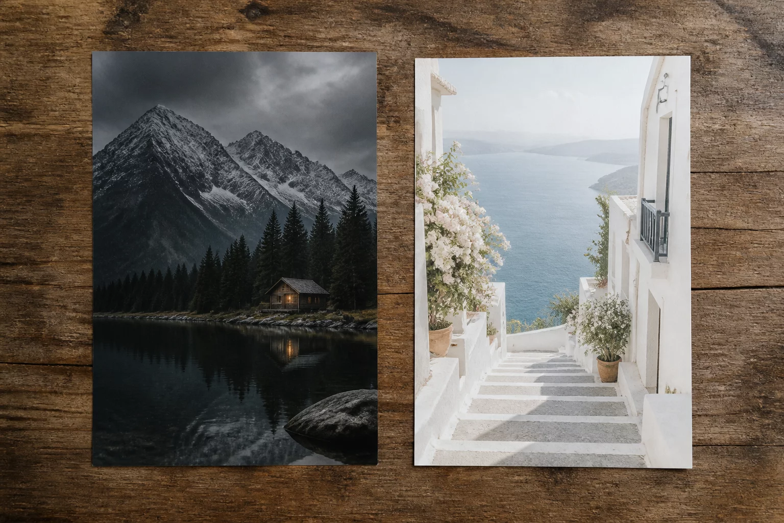
Photographers frequently construct balanced, atmospheric interpretations of their files, only to watch commissioners point instantly to the lighter, punchier alternative. What feels like artistic nuance to the retoucher often appears sluggish or veiled on standard mobile screens and uncalibrated office monitors.
In side-by-side proofing sessions, higher luminance creates an immediate impression of sharpness and cleanliness. The human visual system gravitates toward elevated luminance because it interprets open shadow values as accessible product information rather than compositional subtlety.
Environmental Context and Commercial Risk
Buyers inspect previews in conference spaces or on smartphones under daylight conditions where subtle tonal subtleties vanish into ambient glare. Darker midtones turn muddy, fine fabric weaves sink into deep blacks, and the core subject demands excessive optical effort to parse. A brighter variant cuts through ambient reflections with zero cognitive friction.
- Open midtones convey product transparency and reliable fabric fidelity.
- Elevated white points combat low-brightness mobile displays without color degradation.
- Higher overall luminescence stimulates positive psychological associations with freshness.
Rather than resisting this bias, disciplined technicians build deliberate alternate variants in Capture One to test commercial clarity before final client sign-off. Isolating a deliberate +0.4 EV proof variant saves hours of revision cycles by addressing presentation physics upfront.